How to Use Photography in UI Design: Best Practice, Tips & Tools
Dieser Inhalt wurde noch nicht ins Deutsch übersetzt. Wir zeigen Ihnen unten die englische Version.
Photography can be quite versatile when it comes to content creation. It can be used in virtually everything – social media posts, articles, e-books, and even UI design. In fact, using photography in your UI design can help you make your website look livelier.
If you follow common best practices and use tools to help you, you can make photography an integral and valuable part of your UI design. Hence, here’s everything you need to know about how you can do this.
Best Practices of Using Photography in UI Design
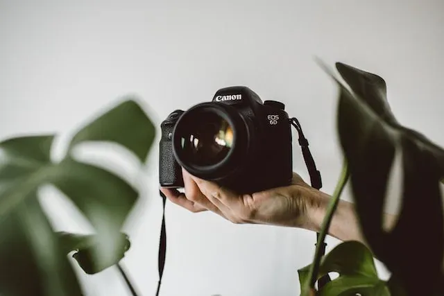
UI design has its own set of rules and best practices that designers usually use. But when you want to include photography in your UI design, you need to realize the nuances associated with doing so. Stick to these seven best practices when using photography in UI design:
#1 Maintain High Quality Photo
First and foremost, you should always maintain high quality when it comes to using photography in UI design. Every photo you decide to use needs to be of high resolution and in the format most appropriate for your needs. Moreover, you should also look at what is depicted in the photo:
- Color Scheme: Is the photo black-and-white or in color? Does it look balanced?
- Rule of Thirds: Does the composition of the photo correspond to the Rule of Thirds?
- Filters and Edits: Have any filters been used on the photo? Has it been edited (e.g. with the liquid tool)? Does it still look “good”? Is the exposure appropriate?
Read more: 46 Best Free and Royalty-free image websites
#2 Be Consistent with Contrast
One of the most important rules in design is consistency. This also applies to the way you use photography in UI design. You need to be consistent with your visual branding which includes being consistent in your UI design. More specifically, always be consistent with the way you use contrast in your design.For example, when you put text over photos, the contrast between the text and the background image needs to be consistent over multiple photographs. This can be challenging if your photographs vary in color schemes or editing styles. That’s why you should also be consistent with the photos you choose to use (more on this later).
#3 Ensure Relevance for Photos
Another thing to keep in mind is that all your photographs need to be relevant. Where you place them and which kind of content accompanies them will determine whether they are relevant. For instance, if you have a text about a specific event, you need to use photos takenduring that event.
The relevance of your photographs can work both ways. In other words, you can choose photos for your texts or you can write texts for your photos. To do the latter more efficiently, you can hire an experienced writer from the writing services reviews site Rated by Students who will help you create your content.
#4 Repeat Visual Motifs
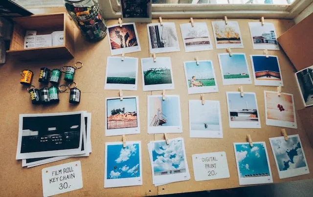
As explained earlier, consistency is essential in design which is why you need to be consistent with the way you use text in your photos. At the same time, you need to be consistent with your photos – repeat visual motifs across the photography you choose to use in your UI design.
Essentially, this means that you need to have the same editing style across all the photos you use.
Of course, there can still be variations, but it depends on the context. For instance, you can have one page with all images being black-and-white while a different page will have photos edited in cooler tones. Just make sure that such differences are motivated.
#5 Simplify and Minimize
Less is more – and that’s also true for using photography in UI design. While you can definitely use photos in your designs, you should still make sure that you don’t go overboard with them. Likewise, consider the way you are using these photographs when integrating them into UI design, and try to simplify your editing:
- Minimize the number of text snippets you use with your photographs
- Simplify the editing and filters to keep it neat and natural
- Integrate photography into your UI design seamlessly
#6 Integrating UI Design Technique
Integrating your design technique into UI design is always a good idea, such as adding watermark content on the photograph, making photo fade, flat or even contrast to make the photo pop in your UI! but how to do them?
Check out these 3 step by step guides videos from Gary Simon who teaches people about integrating UI design with your photography.
- Photography in UI Design can look GREAT - UI/UX Workshop — Redesign 3 website UI using photography.
- 4 Ways to use Photographs in your UI Designs — Using watermark, fade, unicorn and flat techniques and methods to create a section of a UI that features a prominent photograph.
- 6 Ways to Use Photographs in your Layouts! UI/UX — Demonstrate 6 different design technique to integrate the same photograph in the same layout.
#7 Utilize Tools for Editing
It goes without saying that you are already using different tools to help you work with UI design. However, you might not be using all the different tools available to you, especially when it comes to integrating photography into UI design.
These tools range from grammar checkers to image cropping tools to GIF creators. And when it comes to editing text, you can also hire an experienced editor from the writing services reviews site Rated by Students who will make sure that there are no stylistic mistakes and that the text serves its purpose.
Tools for Using Photography in UI Design
In addition to using common best practices for including photography in UI design, youshould also take a look at these tools that can help you make your design process easier:
#1 Image Editor Figma plugin
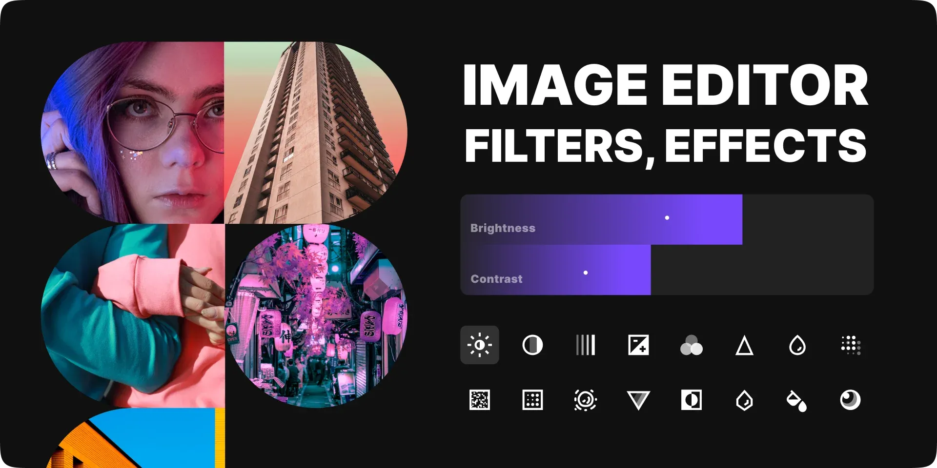
The Image Editor Figma plugin is one of the best image editors for using filters and effects on your images. It is quite easy to start using, so even beginners will find it helpful. Some of the features included in the editor range from exposure and brightness adjustment to noise and lens blur filters. In other words, it is an ideal option for anyone who wants to edit their images quickly while maintaining high quality.
#2 Unsplash Figma plugin
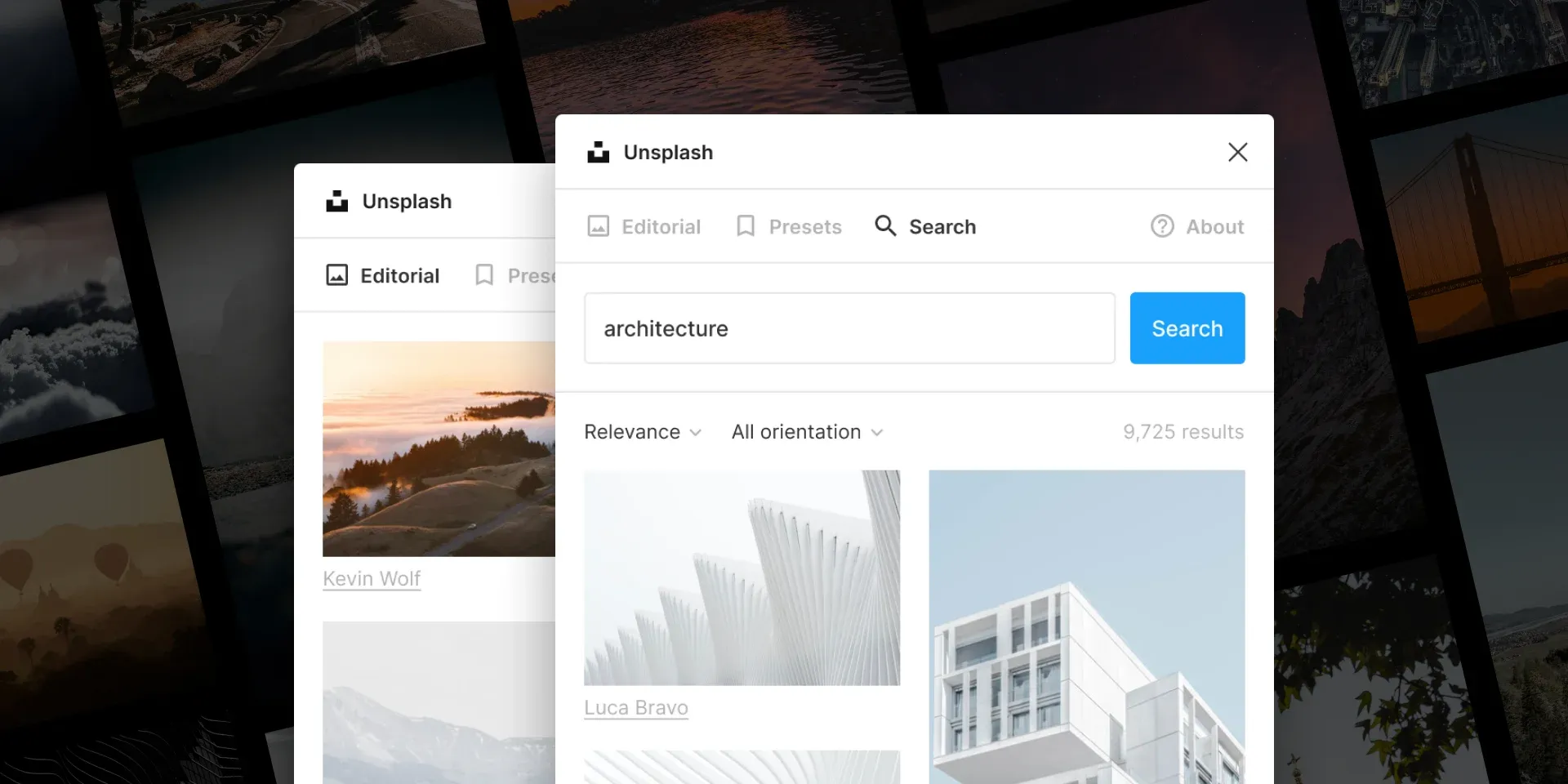
Unsplash is a stock image collection website where all the available images can be used by anyone for free. Essentially, this means that you get access to a pretty big library of how quality images without having to pay for anything. You can give credit to the owners if you want to, but it is not required. The Unsplash Figma plugin makes using the photos from the website even easier. You can insert the images from Unsplash directly into your designs. This will streamline your workflow and help you become more efficient when working with stock photography.
#3 Eagle
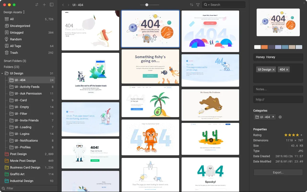
Eagle is a tool that can help you organize your reference images in one place. It is an unconventional tool that many designers can benefit from because it is a way to organize
your design process before and during your work itself. For instance, you can start your work by consulting the visual branding guide. Then, you can determine the themes and topics that your designs will be contextualized by.
After you determine what these are, you can start looking for reference images and then organizing them with the help of Eagle. When you start creating your design, use your organized reference images to create the kind of design you want and need.
#4 Grammarly
As mentioned earlier, you can use text in UI design in addition to the photographs you include. When you decide to use text, Grammarly will be the right tool to use at all times.This free online tool lets you check texts for grammar, spelling, punctuation, and word choice mistakes. You can even set up different details about the text (e.g. US vs UK English) to make the assessment more accurate.
Many graphic and UI designers struggle with writing content and copy, so you to help you with that, you can hire a professional writer from the custom writing reviews site Top WritingReviews. An expert writer will help you craft the best text for your designs that will fit perfectly with your photos.
#5 Google Lens
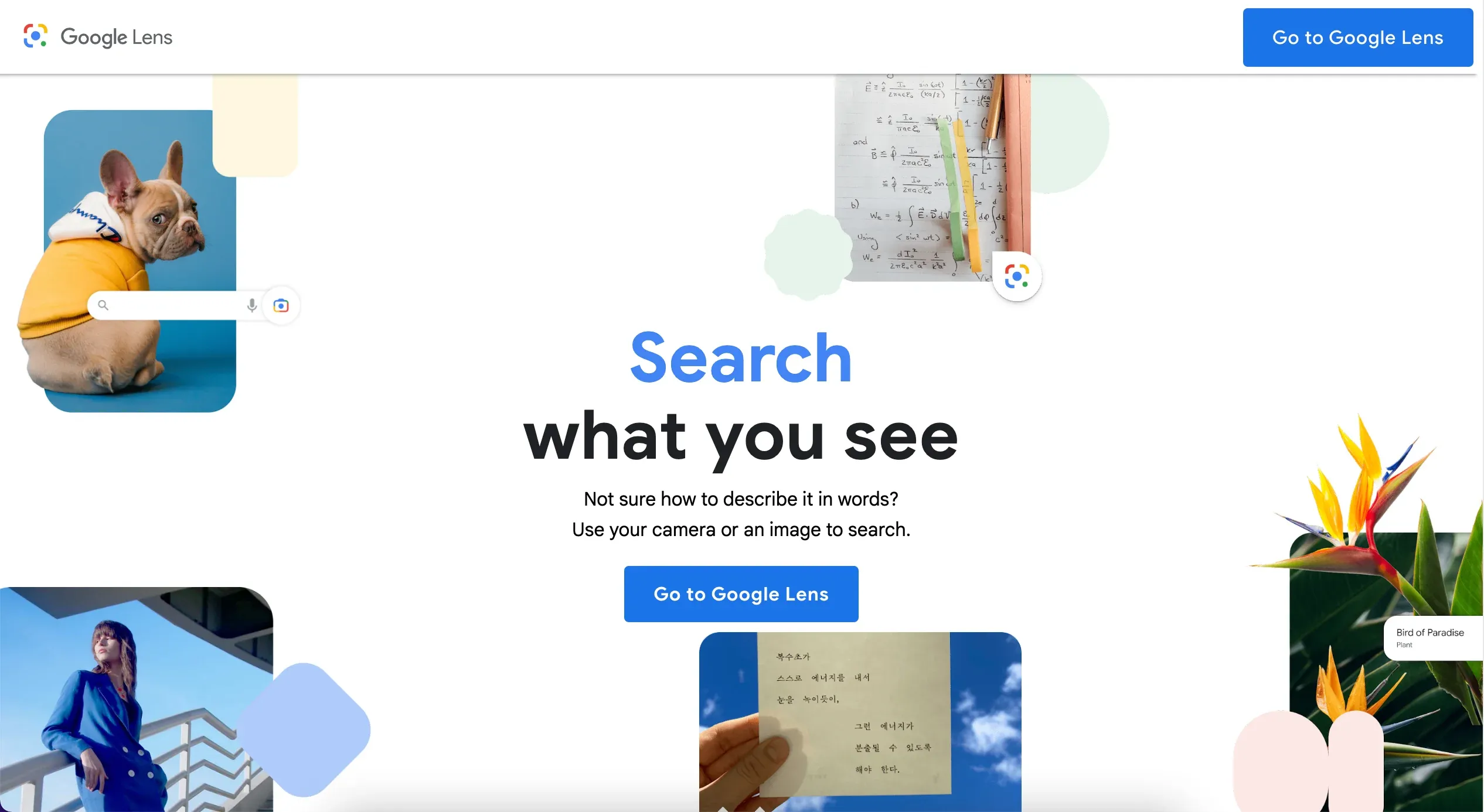
There are times when you will come across photos you want to use that you don’t know the source for. You can’t just use a photo you randomly found online without giving credit, so using Google Lens will be of the utmost importance in such situations.
This tool helps you perform an image search by clicking on the photo and finding images that look similar to it. You can then see where the photo you want to use came from and whether you can use it in the first place.
#6 Pinterest
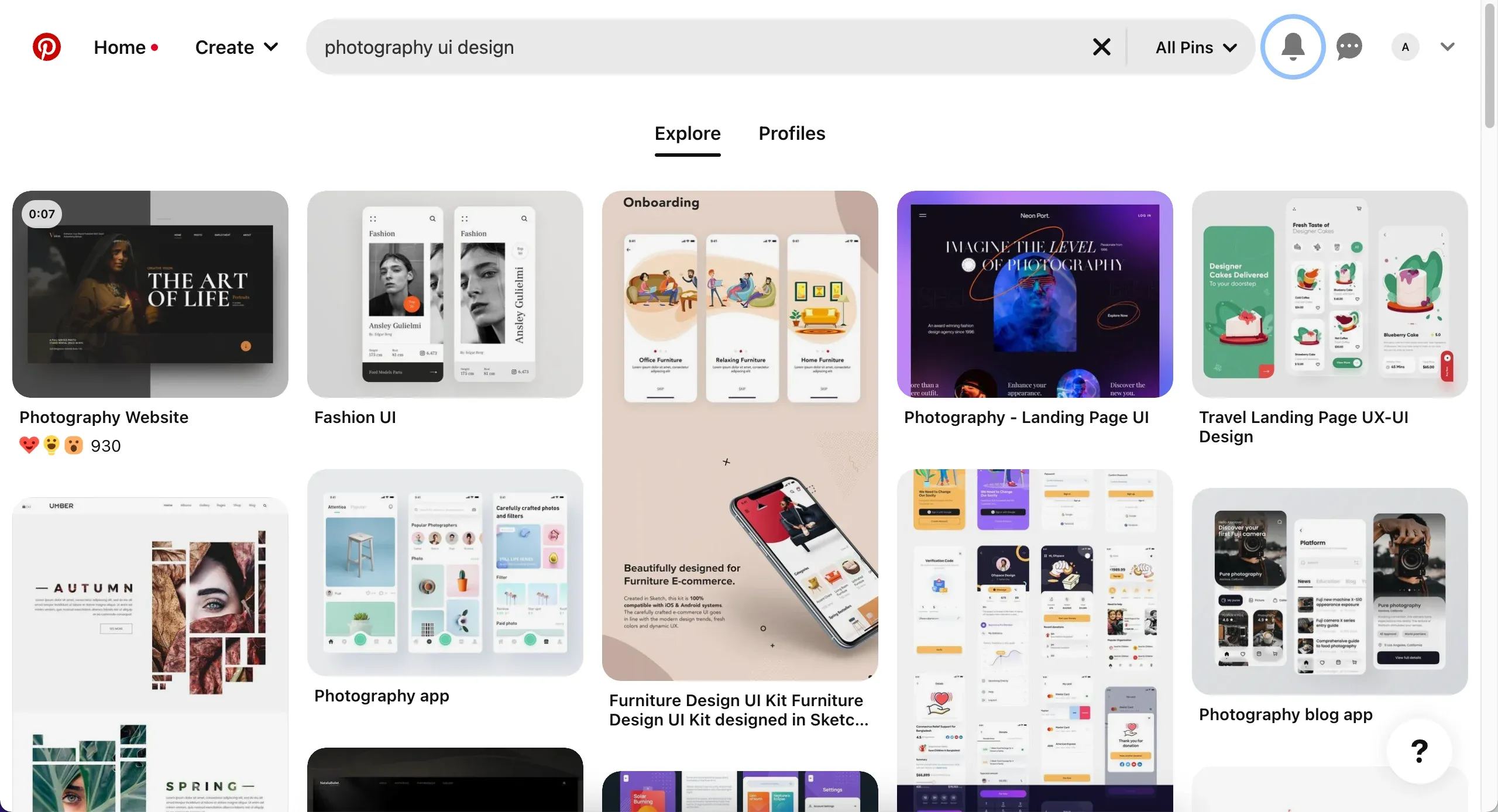
Pinterest is by far one of the most popular visual social media platforms. While Instagram dominates this field, Pinterest is not far behind and is known for being the perfect place to find inspiration for anything you can think of – from outfits to cooking to architecture.
As a graphic designer, you can find inspiration in anything and everything. When you start looking for reference images, use Pinterest as your starting point. It can help you find some of the best images specifically for your needs.
Read more:
- How to Overcome Design Inspiration Blocks?
- 43 Best Websites Designers Love for Finding Design inspirations
Conclusion
All in all, using photography in your UI design can definitely help you enrich it and make it more appealing to your audience. Use the practices and tools listed in this article to help you make the most of photography when using it for UI design.
