13 Most Common Web Design Mistakes To Learn From
Dieser Inhalt wurde noch nicht ins Deutsch übersetzt. Wir zeigen Ihnen unten die englische Version.
Introduction
Mastering website design can be challenging, particularly for businesses that struggle to create appealing designs that generate revenue. Instead of focusing on a design that maximizes conversion rates, many businesses prioritize aesthetics.
These mistakes can have significant negative effects, such as creating difficulties for customers when purchasing, introducing unnecessary objections and issues, and overwhelming visitors, ultimately pushing them away from the website.
To improve website traffic, leads, and sales, businesses must avoid making these mistakes and identify the specific issues that may be hurting their website. While fixing these issues requires effort, simple and consistent work can significantly improve website performance.
But before we look at the mistakes, let's understand:
What is Web Design, and why is it important?
Web design is a cyclical process that involves strategizing, conceptualizing, and delivering information and business functionality in an attractive and visually pleasing layout. The visual elements of web design include various components such as text content, images, videos, colours, fonts, and different elements and shapes such as buttons, forms, and icons. It also encompasses the spacing between these elements and the website's overall layout.
Design functionality is an equally important aspect of web design, which includes factors such as UX design and SEO integration, website speed, navigation, animation, user interaction, the overall technical architecture of the site, cross-browser, cross-platform, and cross-device design consistency, and responsiveness.
In simpler terms, web design is about creating an aesthetically appealing website layout that delivers information and business functionality. It involves using visual elements such as text, images, videos, colours, and shapes and ensuring that these elements are visually pleasing. Design functionality includes factors such as website speed, navigation, user experience, and responsiveness.
All these elements combine to create an effective website that engages and retains users while also providing them with the information and functionality they need.
Top Web Design Mistakes to avoid
1. The pitfalls of poor navigation layout

Image from hubspot
A major web design mistake designers commonly make is a poorly configured menu and navigation layout. This often happens when designers skip essential steps such as brainstorming, sitemap creation, and wireframing. A poorly structured navigational layout can be frustrating for website visitors and lead to them leaving the site like in the case of Zara as shown above.
For websites with many pages, grouping them into categories and arranging them hierarchically is advisable to create an intuitive navigation structure for users. It is also important to consider that navigation may differ for various devices, so designers must select the appropriate strategy for each device.
By taking the necessary steps to create a well-planned and user-friendly navigation structure, designers can prevent driving users away and increase the likelihood of keeping visitors engaged on the website. Therefore it is really important to focus on having effective Landing Page Design to increase conversion.
2. Not paying enough attention to search
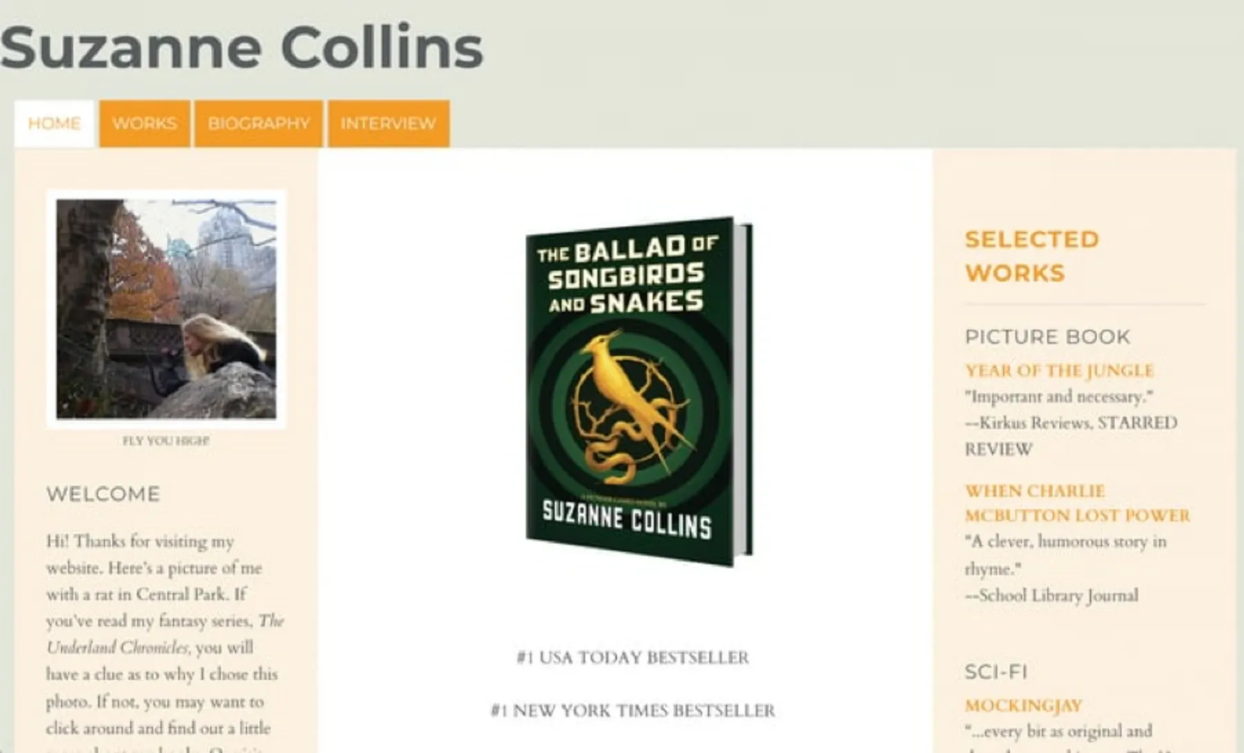
Image from zyro
If a website's navigation could be more effective, users may turn to the search feature to find what they are looking for. However, if a website search cannot handle typos, plurals, hyphens, or other variations of search terms, it can lead to a negative user experience.
For example, the image you see on top doesn’t even have the right search bar for visitors to search for a specific requirement.
This can have several detrimental effects on the website's overall performance, including frustrating users, reducing engagement, harming SEO, and decreasing conversions. These negative impacts can lead to a high bounce rate, lower user engagement, decreased search engine ranking, and lost sales opportunities.
It's important to note that not all websites need a search function. Still, for those that do, it's essential to ensure that the search algorithm is optimized and the search functionality is continuously tested. Additionally, designers can improve the search experience by implementing auto-complete and suggesting options in the search bar to help users get faster and more accurate results.
3. Not considering accessibility factors
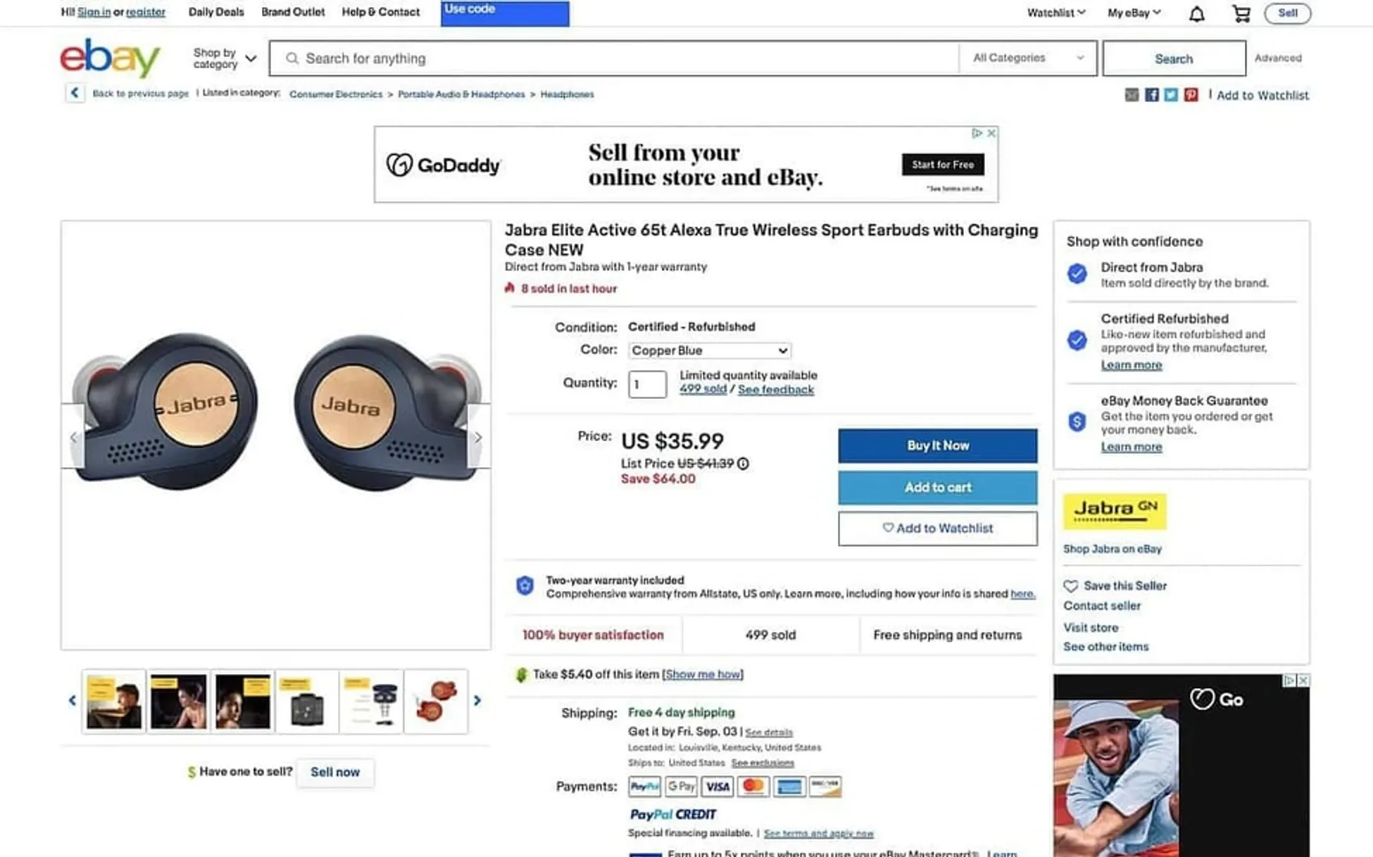
Image from hubspot
A report published by the World Health Organization (WHO) stated that approximately 1.6 billion individuals, equivalent to 16% of the world's population, have special abilities. However, designers often need to pay more attention to this aspect when designing websites and user experiences.
In the example above, since the product page is so complicated, it is really difficult to figure out any information.
This can lead to one of the most significant and frequent web design mistakes. Many people have diverse special needs, and failing to include these users in the design-thinking approach can be detrimental.
Website accessibility is vital for individuals with special needs. Text size, color contrast, page titles, image alternate text, keyboard accessibility, and moving and blinking content such as carousels, ads, auto-playing videos, scrolling news feeds, and tickers are all critical components that need to be taken into consideration.
For example, a person with hypermetropia might need to zoom in on the content on small devices, while someone with visual impairments may prefer speech to consume content rather than text. An individual with an attention deficit may want to pause carousels, and so on. A good web design incorporates all these aspects to improve website accessibility. Failing to do so could result in a poor user experience and adversely affect your business.
4. Failure to prioritise website security

Image from hubspot
Website security is not solely a technical aspect of a website's architecture but is also linked to website design and user experience. Many common web design mistakes can be prevented by prioritising website security from the design stage. One of the significant design considerations is how designers depict user journeys, which impacts how developers implement the design.
In the example above, there is no navigation layout provided and additionally, when you click on certain areas, new tabs are opened which is risky.
For instance, business-critical data should be secured behind authentication and payment walls. The failure to utilise HTTPS, weak password requirements, lack of user authentication, and backup and recovery strategies are some common website security-related web design mistakes that should be avoided.
HTTPS is critical for protecting sensitive data; strong password requirements should be enforced, user authentication should be implemented, and backup and recovery procedures should be in place to ensure website data can be recovered in case of a disaster.
5. Designing Websites that are Not Responsive to Different Devices and Screen Sizes

Image from hubspot
Above image is an example of having a layout that does not adapt to mobile screen sizes effectively.
To provide an omnichannel experience, it's important for the design to be responsive and consistent across all devices and browsers. A common mistake in web design is creating separate user journeys and maps for various platforms and devices. It's essential to maintain consistency across devices whenever possible.
Non-responsive designs can lead to negative impacts, such as higher maintenance costs, poor user experience, and reduced traffic. Keeping a separate mobile version of a website can be expensive and time-consuming, whereas responsive websites can adapt to different screen sizes and devices, reducing maintenance costs. A non-responsive website can make it difficult for mobile users to use and interact with the site, resulting in a poor user experience, high bounce rate, and low engagement.
Moreover, a non-responsive website may need to rank better in mobile search results, leading to a decline in traffic to the site.
To avoid this mistake, it's crucial to ensure good responsiveness and test it before going live.
6. Failure to Adopt a Design Thinking Approach
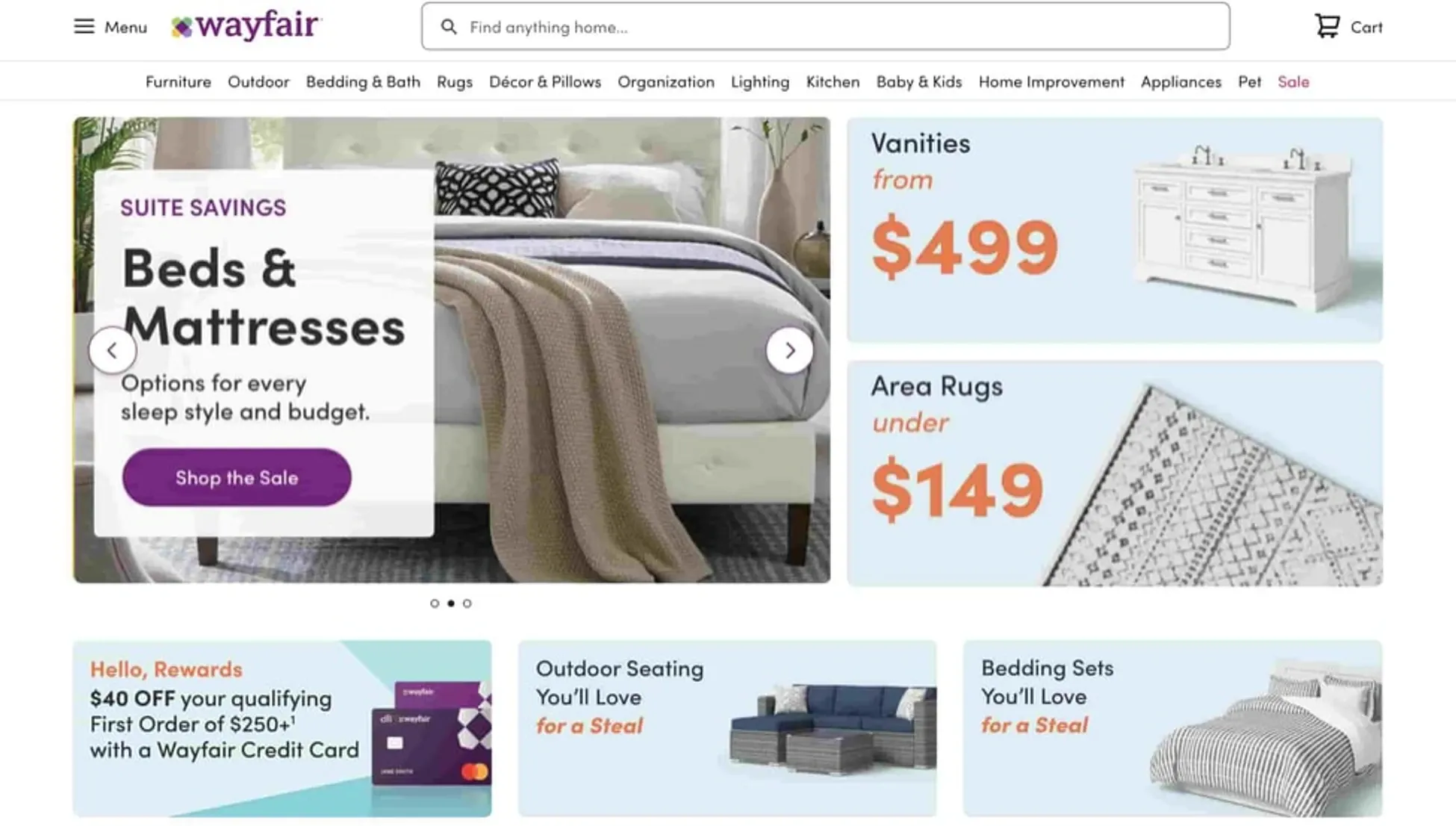
Image from hubspot
A frequent mistake made by web designers is disregarding the significance of design thinking and sketching the layout on paper. Instead of conducting comprehensive user research to comprehend user needs, designers often presume things about users.
In the example above, there are multiple images that are grabbing your attention. No consistency or focus is provided.
This is an inappropriate approach to web design. The design thinking approach is a process that recognizes and identifies customer requirements and motivations. It is a mindset that sympathises with customers, analyses their issues, and creates solutions.
7. Designing Ineffective Call-to-Actions (CTAs)
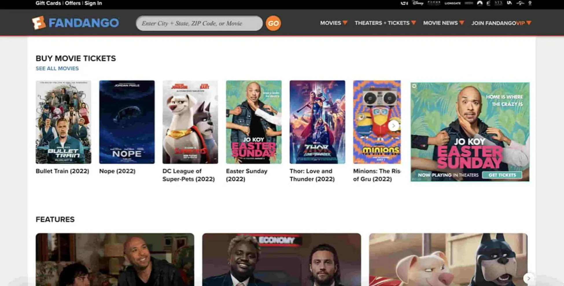
Image from hubspot
In the example above, there are no clear CTAs provided to determine what the visitor needs to do.
Your CTA (call-to-action) is a crucial component of your website that guides visitors toward taking a specific action, such as clicking a button or filling out a form. It's imperative that your CTA conveys a clear message to visitors about what action they should take. Visitors should understand the benefits of taking action and the information they need to provide.
It's important to strike a balance between helpfulness and annoyance. Your CTA should be concise, and visitors should be given some time to explore your page before the CTA appears. It's also advisable to keep the form-filling process to a minimum.
8. Ineffective utilisation of content and whitespace is a common mistake in web design
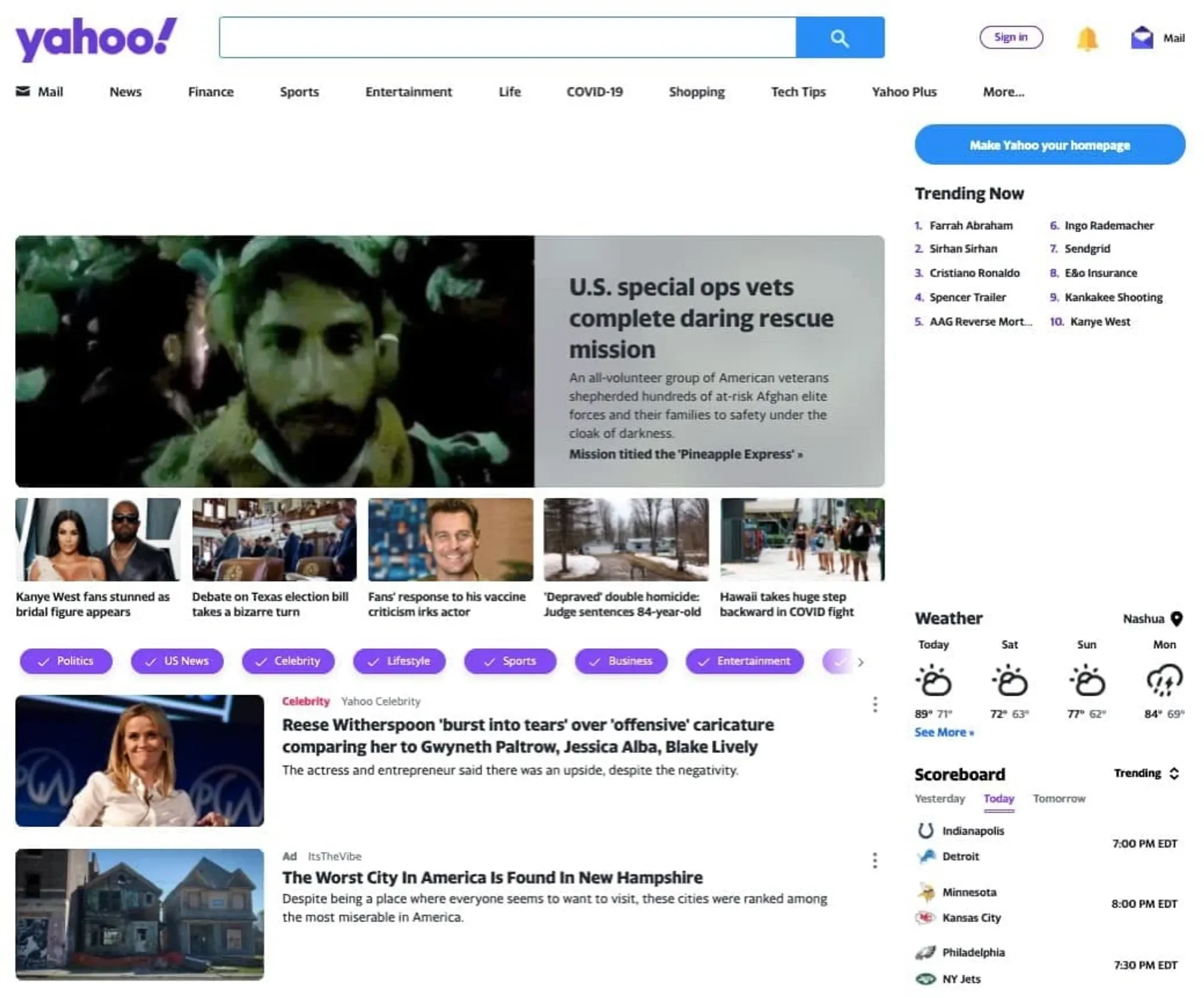
Image from hubspot
Whitespace is a big problem, even in the image above. It makes the visitor wonder if the data is still loading or is the content supposed to be blank.
You need to focus on the content and its presentation to avoid one of the most common website mistakes. Content Strategy plays a crucial role in making the appropriate use of content to communicate your business and products to your audience. It's important to carefully select the font and layout to create an attractive, legible website that reflects your brand image.
Use of Infographics is one of the vital factors that can help you avoid such mistakes. Infographics influence content strategy by offering engaging visuals that can help you enhance the content readability.
Use of whitespace can guide the visitor's eye and reduce the overwhelming feeling of large blocks of text. One major error is overcrowding your website with too much text, which can be mitigated by breaking it up into smaller, manageable chunks and using visual aids where possible. Always keep your content updated to ensure that your customers don't think you're no longer in business.
9. Failing to Reach Your Intended Audience
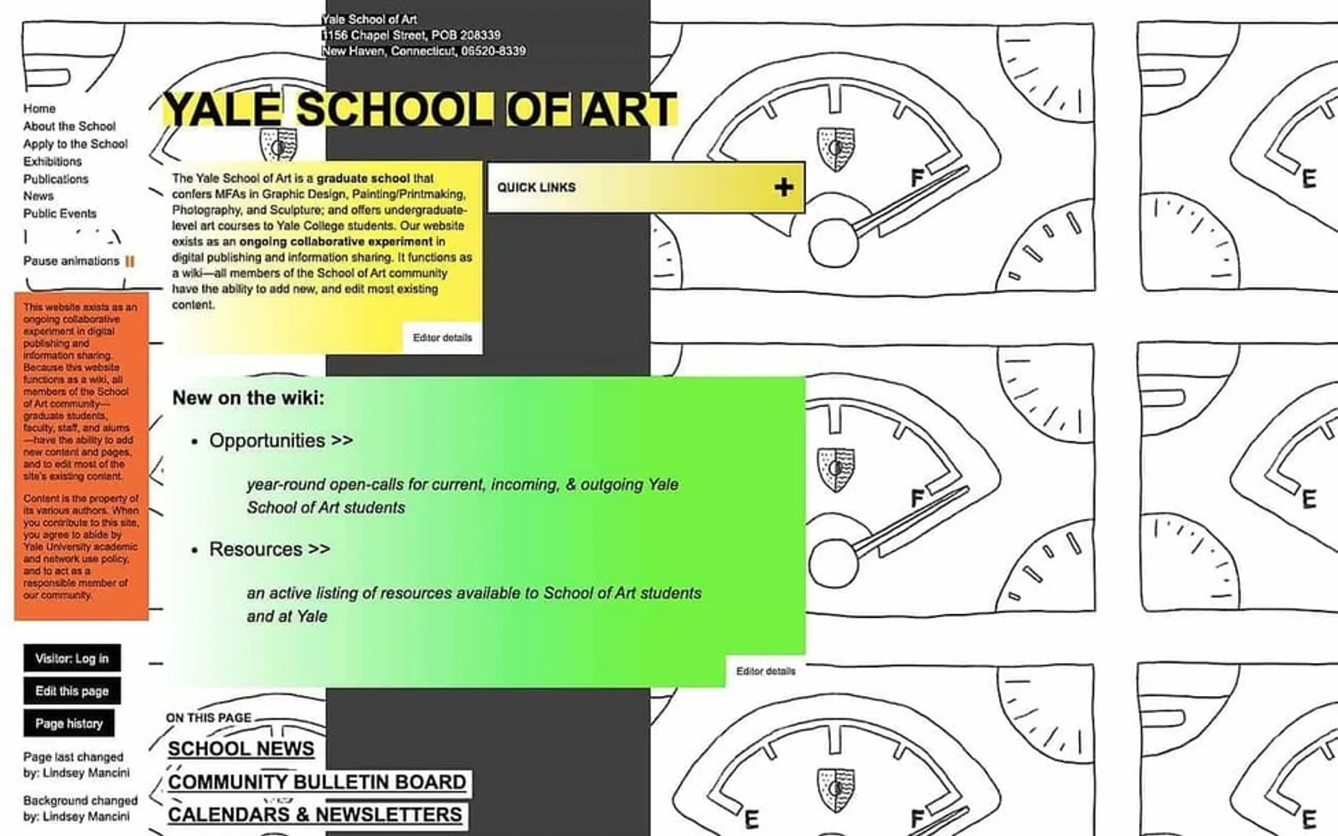
Image from hubspot
In the example above, there are too many things happening, this makes it difficult to appeal to audiences.
As a business owner, you know how imperative it is to understand your target audience. You may have spent considerable time creating customer profiles and developing strategies to capture their attention. The same level of importance applies to web design.
The appearance and tone of your website can naturally attract specific types of visitors. Some websites may appear professional, while others may seem trendy and fun. Attempting to cater to too many audiences may result in a clearer website. Identifying and profiling your target audience and designing your website is crucial.
10. Not Providing Contact Information
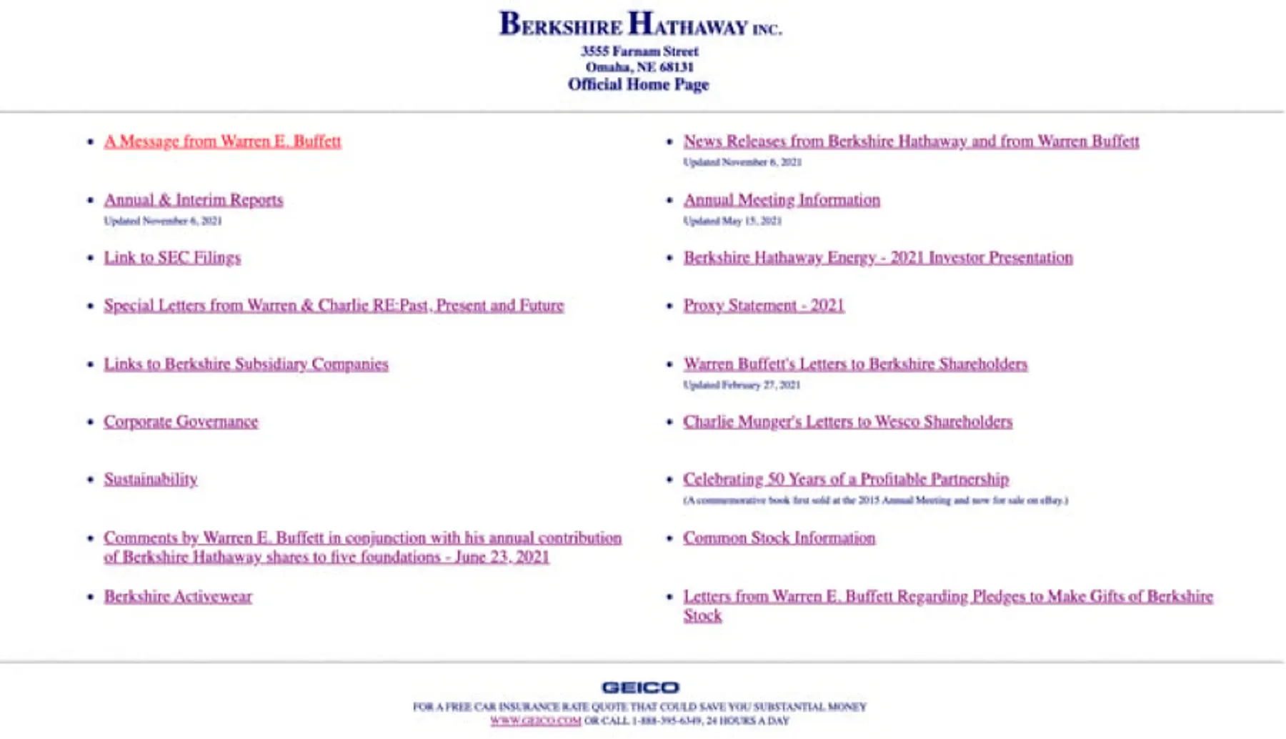
Image from zyro
This website image is a complete mess, there is too much information but no way to contact them and get in touch.
A common mistake that website owners make is to provide more contact information. It is essential to provide customers with contact information the moment when they are interested in making a purchase or using your services.
Visitors who need help finding the contact information easily may become frustrated and leave. Your "Contact Us" page should be easily accessible. Ideally, just one click away, and the information should also be available at the bottom of every page.
11. Putting Ads in the Wrong Places

Image from hubspot
Putting ads in the wrong places and putting too many ads, both are a problem in this instance.
In the world of web design, advertising is a vital source of income, particularly for blogs. Nonetheless, excessive or intrusive ads may irritate your visitors and cause you to lose customers. Therefore, monitoring your ads and being mindful of their placement is crucial.
If you find them irritating or frustrating, your visitors will also. Pop-ups are especially important to keep an eye on; while they are becoming popular again, ensure that they are simple to close and only occupy part of the screen.
12. Neglecting cross-browser compatibility

Image from hubspot
If your website design is difficult to comprehend, like in the case of the above image then cross-browser compatibility will be an even bigger problem.
Once the development phase is complete, and all the necessary steps have been taken to avoid web design mistakes, testing the website becomes crucial. With many devices that vary in physical and internal features, testing ensures a smooth user experience across different platforms.
Different types of testing, such as cross-browser, usability, and A/B testing, are required for different goals. However, one of the most common web design mistakes that developers make is assuming that a redesigned website is perfect and paying attention to browser compatibility testing. They may feel that the website's functionalities are similar to the previous version, so rechecking them is unnecessary.
13. Avoiding Crucial Analytics

Image from pixabay
Website Analysis on a timely basis is really important to make necessary improvements. Therefore for example if we avoid analytics, it will keep us unaware about the Website performance and also about any of the design or Page interconnectivity issues.
The design aspect of a website is a form of creative work that can be improved continuously. By utilising advanced analytics tools, the administrator of your website's analytics can provide information on how users interact with your site.
Additionally, analytics and testing can help identify broken links on your site. With the aid of analytics, you can uncover issues with the user journey, determine what is functioning well and what needs improvement, identify which calls-to-action are being clicked, and figure out which ones need enhancements.
Conclusion
Your website can be one of the most important assets for your business, which is why it's crucial to make sure it creates a great first impression. However, there are numerous web design mistakes that can hinder your website's usability, performance, and overall effectiveness. These mistakes can range from choosing the wrong colour scheme to overusing animations and effects. It's important to avoid these common website design mistakes as they can impact your website's ability to attract and retain visitors.
Fortunately, these mistakes are relatively easy to avoid and fix. The hardest part is identifying them, but now that you know what they are, you can take steps to avoid or fix them in the future. It's essential to prioritise functionality and usability over aesthetics and keep your target audience and website goals in mind. By doing so, you can create a website that is aesthetically pleasing, easy to use, and functional, which will help you make a positive impression on potential customers and achieve your business goals.

