5 Animated Video Design Tweaks for Captivating Viewers
Dieser Inhalt wurde noch nicht ins Deutsch übersetzt. Wir zeigen Ihnen unten die englische Version.
Even though we now live lives saturated with content — an overwhelming number of emails, news feeds, and notifications popping up on our smartphones everyday — inspired design has the power to catch our eye and stay in our minds long after we come in contact with a great piece of content.
And this is especially true when we come across a charming animated video!
For some time now, brands and content creators have been leveraging the power of animation to generate engagement and promote their messages in creative and unique ways. But we’ve also learned that designing and producing animated content that hits the spot and doesn’t fall flat is much more challenging than you might initially think.
So, what makes some animated content pop out of the screen and into our minds? Why do some animated videos feel forced and out of place while others come across as natural and even familiarly charming?
Today, we will answer those questions by breaking down five crucial animated video design elements, from basics to advanced, and tell you how the video production pros approach each to guarantee an excellent finished product.
Let’s dive right in!

Image from Yum Yum Videos
5 Design Elements You Can Tweak to Make Animated Videos That Captivate Your Viewers
1. Scripting & Storyboarding: Polishing Your Animated Video’s Soul
It's a long way from the start of your video production process until you can share your finished piece with your audience. As you move through this process, your video will probably go through many changes to the point of sometimes becoming wildly different from your original idea, which is a feature, not a bug!
One of the great things about animation is that it gives you an almost infinite canvas to explore your creativity and portray your ideas in unique ways that resonate with your viewers.
However, the other side of that coin is that too much freedom of movement can quickly become overwhelming. And if you try to expand in every direction at once, the core of what could make your animated piece special can be easily lost.
This is why you must develop a solid-yet-flexible script that you polish through detailed storyboarding!
These tools will be the main guides on your video's production journey, ensuring your piece doesn't stray too far from your intended message and the key goals you are going for.
The Script
It works to think of your script as a tree: all your main objectives are the trunk, and all the more specific ideas and details are like branches growing from it. So, make sure the core message of your video is strong, and the rest will follow!
Think about who you are making this video for. Think about these peoples' likes, dislikes, how they talk, and the type of content they prefer, and let those notions guide how you approach your video's script.
As you work on your script, always make production notes and suggestions on potential visuals for different parts of the video or how you are going to use visual communication to illustrate things that reinforce what the words in your script are trying to convey. For example, create a slideshow animated videos can be a fun and effective way to engage your audience and convey your message.
The Storyboard
The basic gist of generating a storyboard for your animated video is to create a series of thumbnail images that illustrate your video’s key scenes.
Not only does it work to give you a more defined sense of what your video might end up looking and feeling like, but it also can help you catch and solve potential issues before they become costly problems.
Things that look great on paper might not translate well into a visual medium. Or maybe different scenes or design ideas you initially had in your head aren’t synergizing well once viewed in your storyboard’s sequential images.
Whatever the case, know that you should look at your storyboard as a lego set. One where you get to tweak, switch and rearrange your video's key visual elements over and over until you get the perfect structure to start developing your video around.
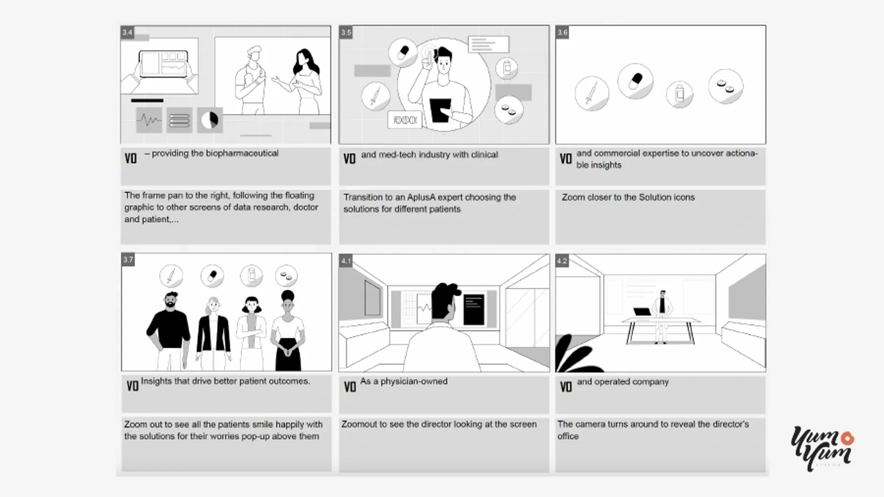
Image from Yum Yum Videos
2. Finding an Animation Style That Breathes Life into Your Ideas
Animation essentially gives you carte blanche to explore your creativity.
When you decide to work on an animated video, you should always be looking for opportunities to show your viewers something novel or unique. Something that showcases what you have to say but does it in a way that will draw them in.
So, even though you’ll most likely have a solid sense of what you want your animated video to look like even before you start working on it, once you have a solid script and are working on a storyboard, you should look into different animation styles or visual design approaches you could take.
Most of the time, you'll probably settle for a style that closely resembles what you already had in mind. But more often than not, you'll also discover new influences or decide to go in an entirely unique and novel direction when something different vibes with you and you feel will also resonate with your viewers.
What to Choose? How to Choose?
Now, even though the sky’s the limit when you are working with animation, you’ll be glad to know there are plenty of styles that most professional animation companies regularly use in their content: traditional 2D and 3D animation are the ones you’ll immediately recognize, but there’s also 2.5D, stop motion, whiteboard videos, motion graphics… there’s more than a few!
Video from Yum Yum Videos
So, the first thing you’ll want to do is look at what is out there and see what inspires your creativity and fits along the lines of your initial video idea. Then, you need to consider the requirements and challenges of producing that given type of animation — for example, 3D animation tends to be more time and resource intensive than its 2D counterparts — and draft an initial production timeline that helps you get organized into what needs to be taken care of.
Once it’s all said and done, you want to settle for something that lives up to your ideal video but also is viable within the limits of your time, budget, and production constraints.
3. Make an Animated Video That Represents YOU
Regardless of the animation style you end up settling on, the next design element you’ll want to spend some time focusing on is branding.
While your video and message should stand on their own — your script will make sure of that — you also need to consider it doesn’t exist in a vacuum, and you want whatever content you put out there to feel unmistakably yours.
Luckily, there are several design elements you can use to help you brand your animated videos in a way that makes anyone watching think about your brand or you as a content creator.
Develop a Defined Color Palette
Stick to a consistent color palette, ideally one built around the colors you already use in the rest of your brand's public-facing content (even if it’s just your social media profile colors).
If you are working on multiple videos, maintaining the same color palette across multiple videos can help you nurture a recognizable style, and even breaking the pattern occasionally can help drive attention to specific points of pieces of content you want to stand out.
Jingles and Meaningful Sound Design
Big corporations have been leveraging the huge power of sound design and jingles in their content for decades to great success; why shouldn't you?
Adding a distinctive tune or jingle you want people to start relating to your work is a great way to set your content apart and trigger recognition from viewers when consuming your content.
Brand Logo
This one is pretty much a no-brainer, but if you have a logo that can identify your content and represent you as a brand, it should feature somewhere in your video. However, do not overdo it!
A subtle watermark in a corner will do the trick most of the time, but you can also feature your animated logo in the intro or outro of your piece, effectively turning it into a branding signature of your work (one that synergizes really well with a distinctive jingle!)
4. Fleshing Out Relatable Characters That Mirror Your Target Audience
One of the key reasons behind some animated videos resonating with their audience lies in how they develop and use their characters.
People love to see themselves reflected in the content they consume because it makes them feel like it’s personalized to address their needs and interests. By the same token, most people tend to dismiss content that feels generic or meant for other people.
So, if you want an animated video that your audience will love and remember, you want to convey your message through characters that bring those ideas to life.
Making Characters That Your Viewers Will Love
To flesh out characters for your video that fit your audience's traits, first, you need to take the time to think about what the bulk of your audience is like, but it's important not to settle with the basics.
Yes, you'll want your video's protagonist to represent the broad strokes of what your ideal audience is like in terms of demographics, but there is so much more you can use to inspire your design choices. How does your audience talk? What type of fashion do they prefer? Do they share a passion or hobby you can portray in your video?
Far from being just philosophical questions, these are data you can use to help you make concrete, visual design decisions in your content that makes it much more likely it will resonate with the people you are designing for.
Last but certainly not least, an interesting and relatable character is the pillar of effective storytelling. Audiences need to empathize with the characters they're watching on screen. Otherwise, they won’t have a real reason to care about what happens to them.
Video from Yum Yum Videos
5. Manage Your Video’s Runtime and Use it Effectively
You might be surprised to learn that runtime is one of the most influential metrics in terms of online video performance. To make a long story short, the shorter you can make a video, the better it tends to perform.
So, with that in mind, one of the most important design choices you’ll have to make when working on your animated videos is how long or short they should be.
Sadly, there isn’t a magic formula or golden rule that can help you answer that question for every video. However, there are two general guiding principles you should keep in mind when working on your piece and use to inform your decision-making during production:
- Online audience engagement drops dramatically after the two-minute mark for most short videos.
- Most people online decide whether or not to continue watching a video within the first 5 seconds.
So, we can draw from those two facts to put together a couple of general principles or guidelines to help you be more productive and make design choices that get the most out of your animated video’s runtime.
Time, It Rules Us All
If you are working on long-form content, the rules are slightly different, as your audience will engage your videos with a different perspective. However, for most forms of online content under the 20-minute mark, there are a couple of runtime-management practices you’ll want to keep in mind:
- Refine your video’s opening scene as much as you can afford to: In the age of short attention spans, the very first few seconds of your video are crucial. Get to your point as fast as possible, and front-load the most engaging parts of your content. Leave slow burns and suspense building for Holywood.
- Always be mindful of that two-minute mark: By the time your video reaches that time, the bulk of your message or the core purpose of your video should already be fulfilled. That way, you ensure that the overwhelming majority of viewers your video managed to catch will at least walk away with the gist of what you were going for.
- Adapt your content to its distribution platform: Online, different audiences on different platforms have different expectations and tolerances. This means that the average TikTok viewer's attention span will vary significantly from people consuming videos on Facebook.
Make a note of where the bulk of your audience gets their content, and adapt your animated video to meet those preferences as much as possible.
A Few Parting Words
In today’s digital landscape, it’s hard to compete against video in terms of audience appeal and engagement, and that’s true across most industries and niches.
However, just making a video doesn’t guarantee it’ll generate the traction and awareness you are looking for.
Animation can certainly be a way to set your content apart from the bulk and provide you with unique opportunities to appeal to your viewers in creative and distinct ways, but you need to leverage the medium to the fullest if you want results.
Luckily, you now understand five crucial design elements you need to pay attention to and develop when working on your animated pieces, and have more than a handful of good ideas to make your next animated piece shine!
Time to let that creativity flow and start working on animated pieces that wow your audience from now on 😉

